RIME Tabular UI
At this point, you should have your first working RIME run. Congratulations! You’re off to a very good start. Assuming you have the RIME backend running locally, you can navigate to the locally deployed projects page and follow along to the guided tour of the RIME UI below.
Projects
This page lists all projects created. Every test run initially belongs to the default project with project id 0. You can create other projects to help organize your various scenarios. Click on the row to see more information about the test runs in the default project.
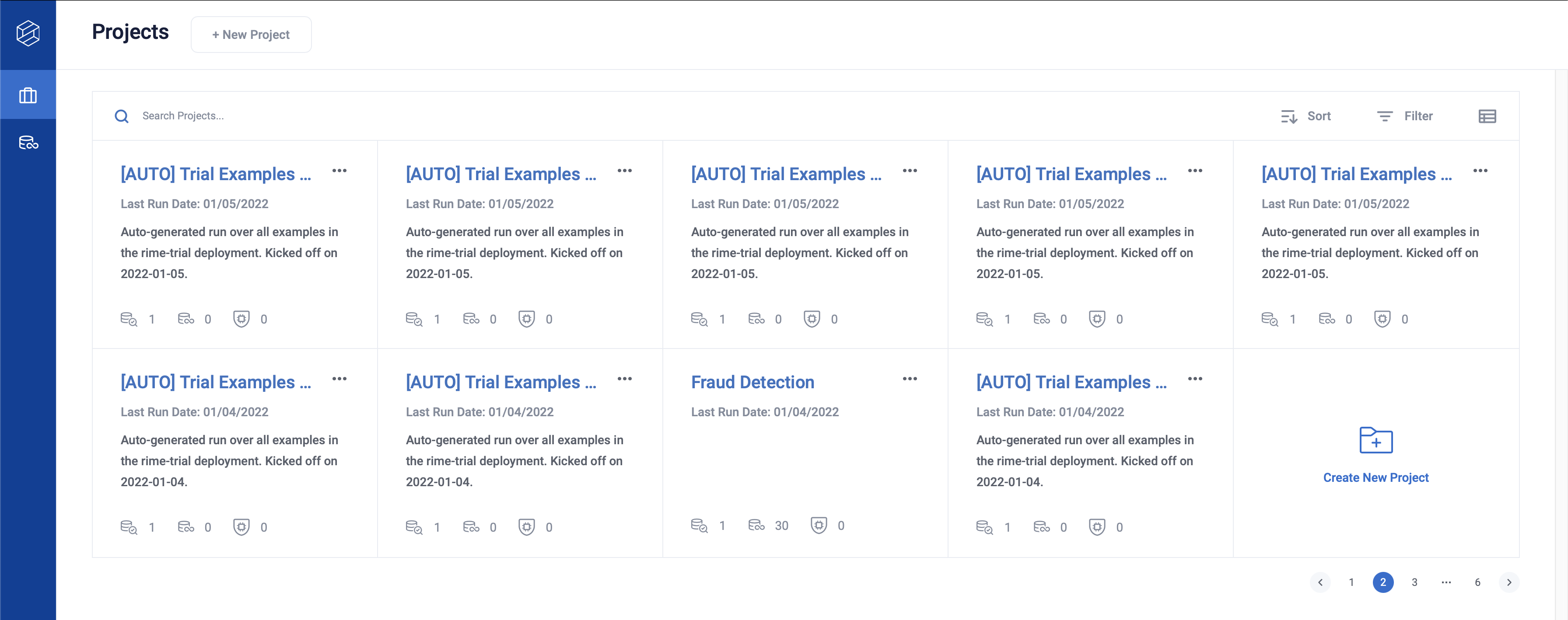
You can create a new project through the [ + New Project ] button on top left.
Runs
This is an entry point to view different RIME test runs. Here, you can get a quick overview of each run and sort runs by clicking a column header.
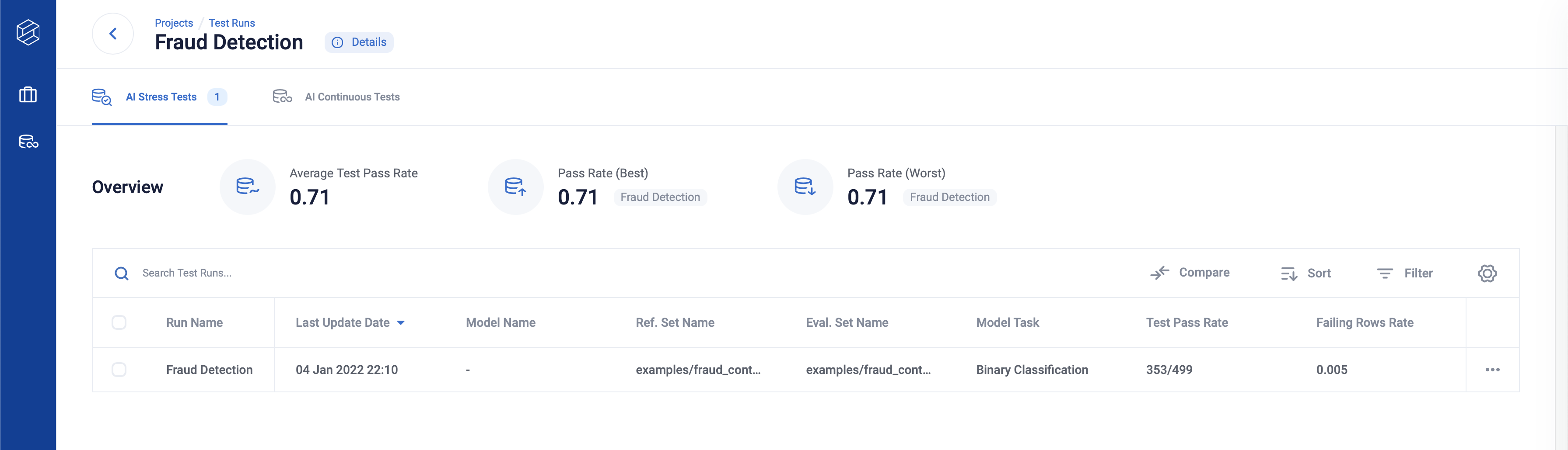
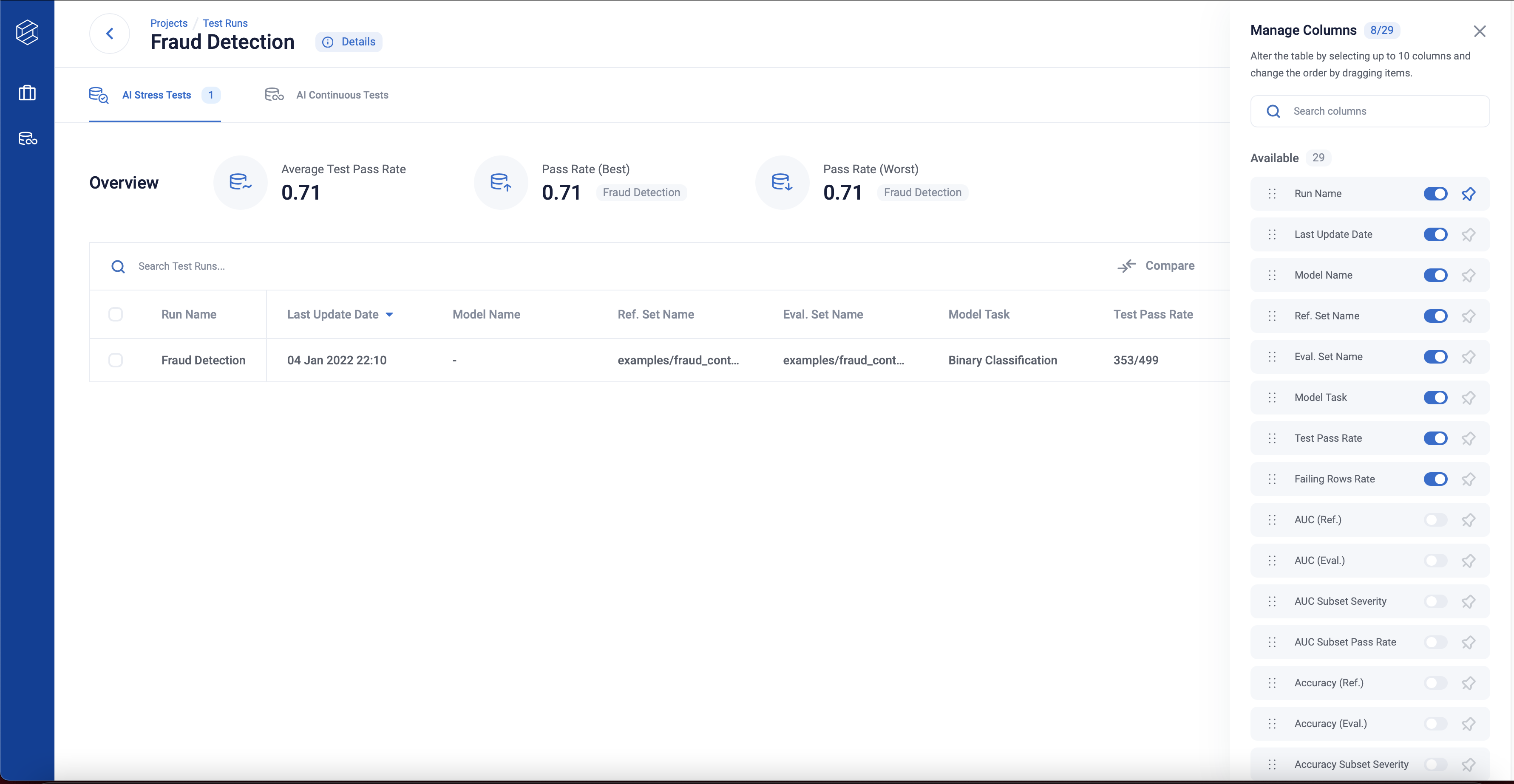
You can compare test runs better through the columns manager, which you can toggle on by clicking the setting icon.
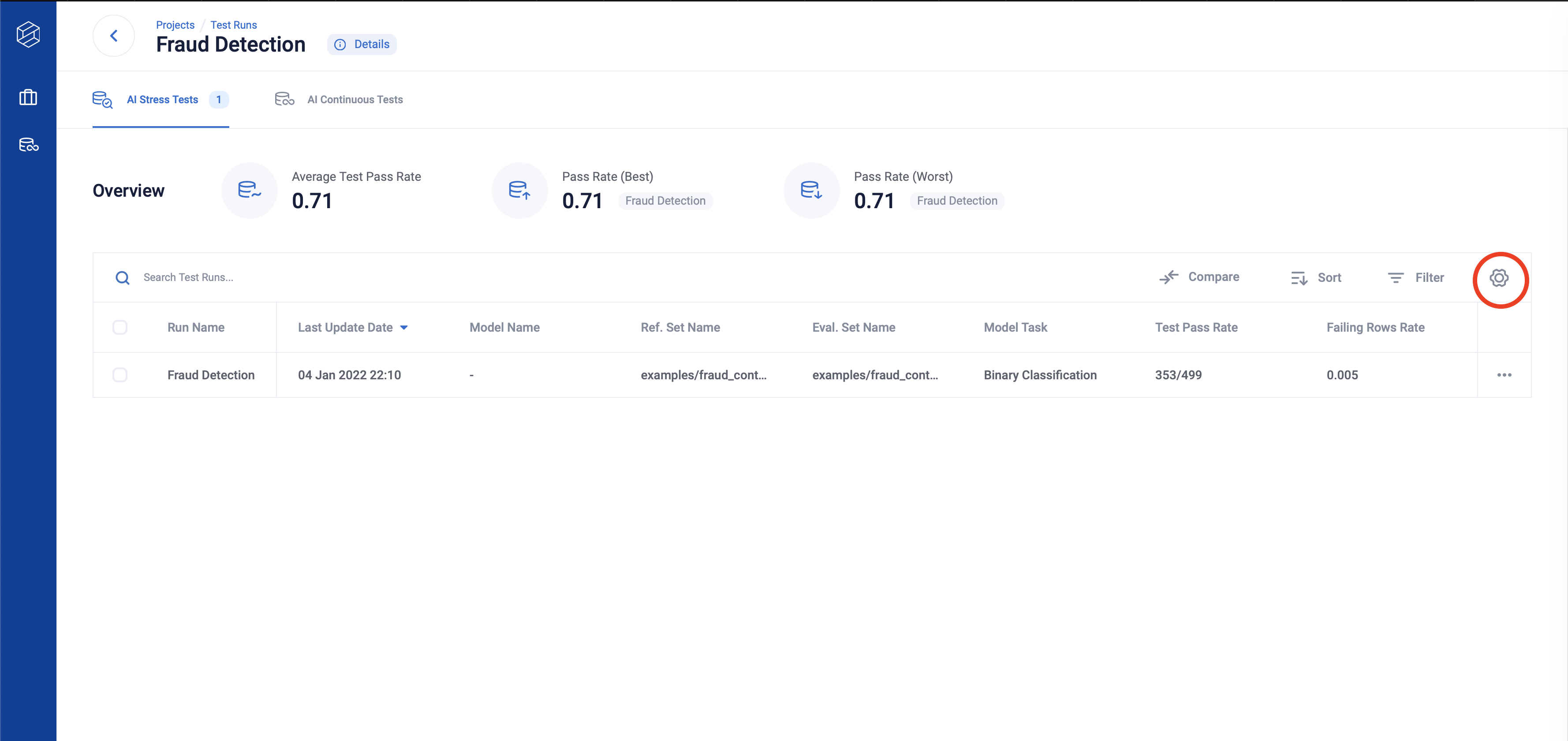
On the columns manager, you can toggle, order and pin the columns you are interested in.
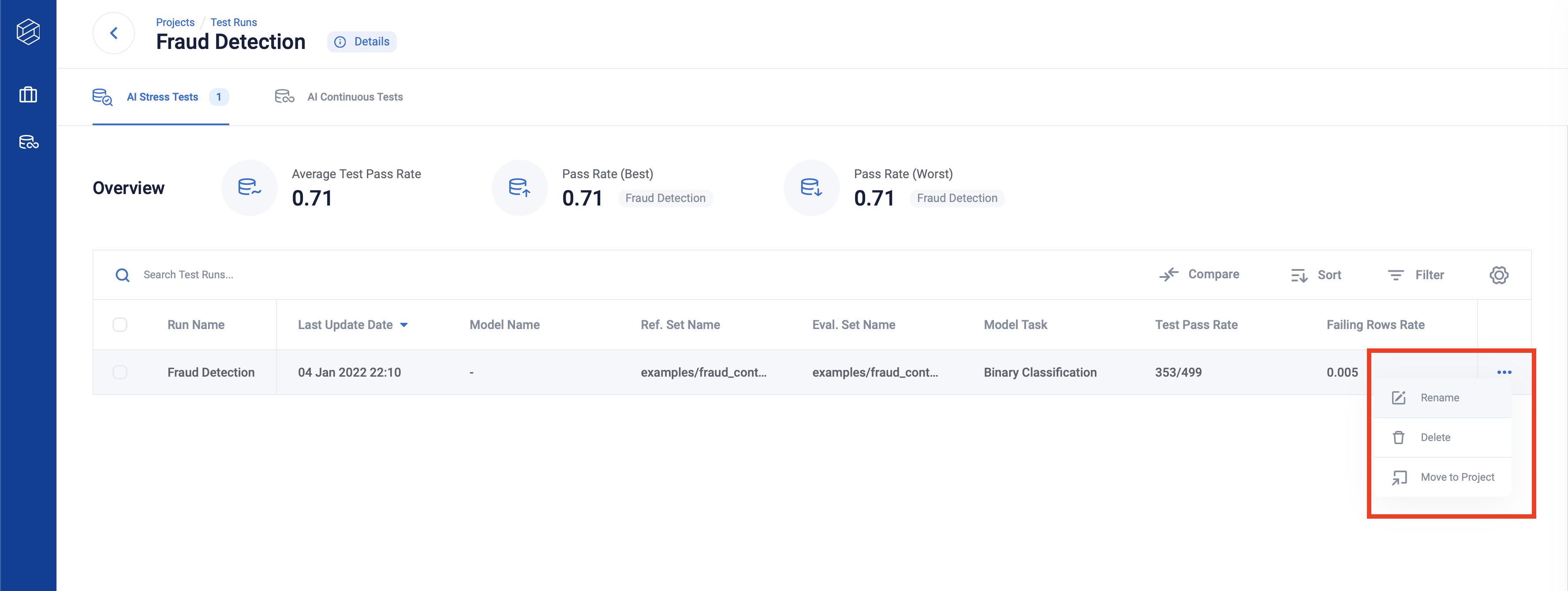
You can also select test run(s) to rename, delete or move them to a different project by clicking on the three dots on the right-hand side of the row.
Click any row to see more detailed testing information about your latest run.
Tip: You can use Shift key + select for specifying the first and last item to multiple-select.
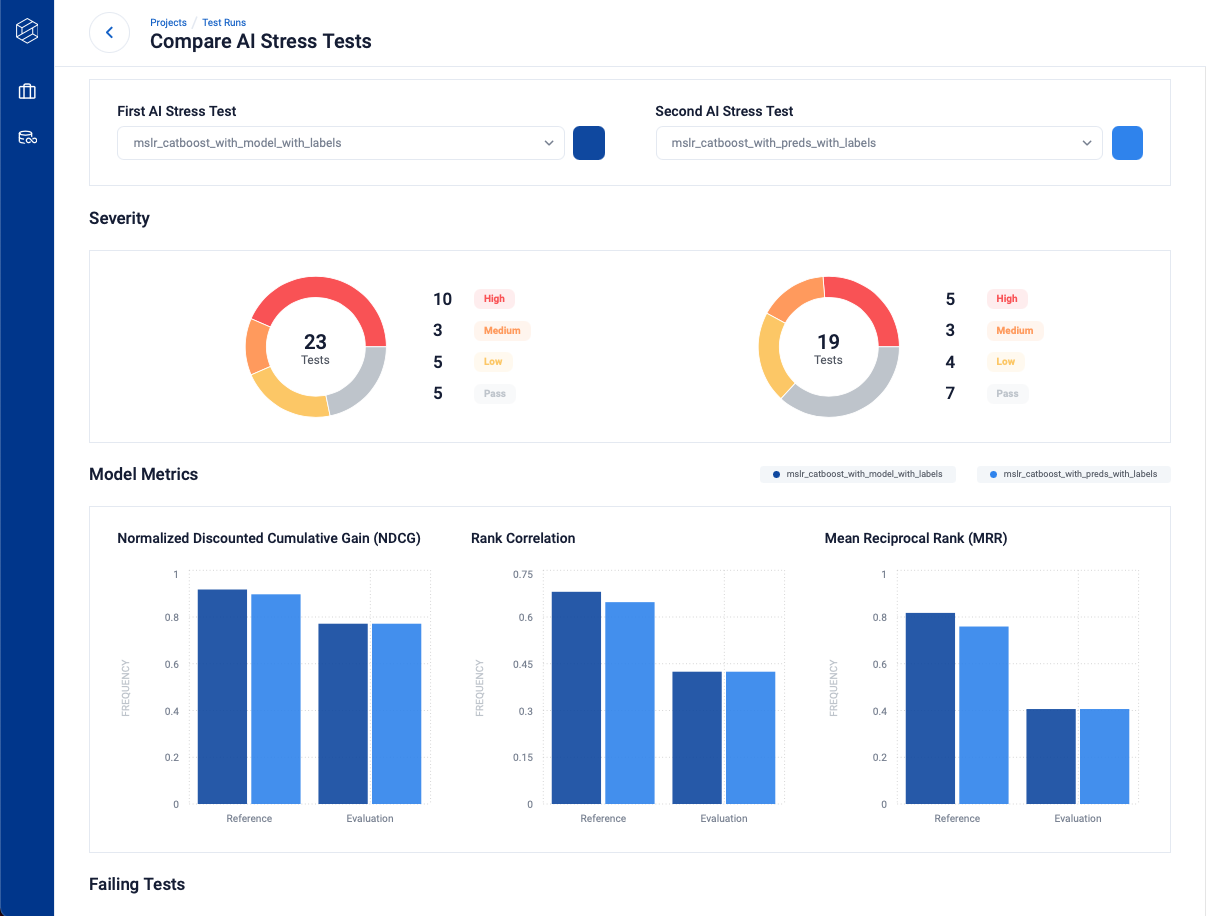
Side by Side Comparisons
Clicking on the “Compare” button on the top of the Test Run Table takes you to the Side by Side Comparison page.
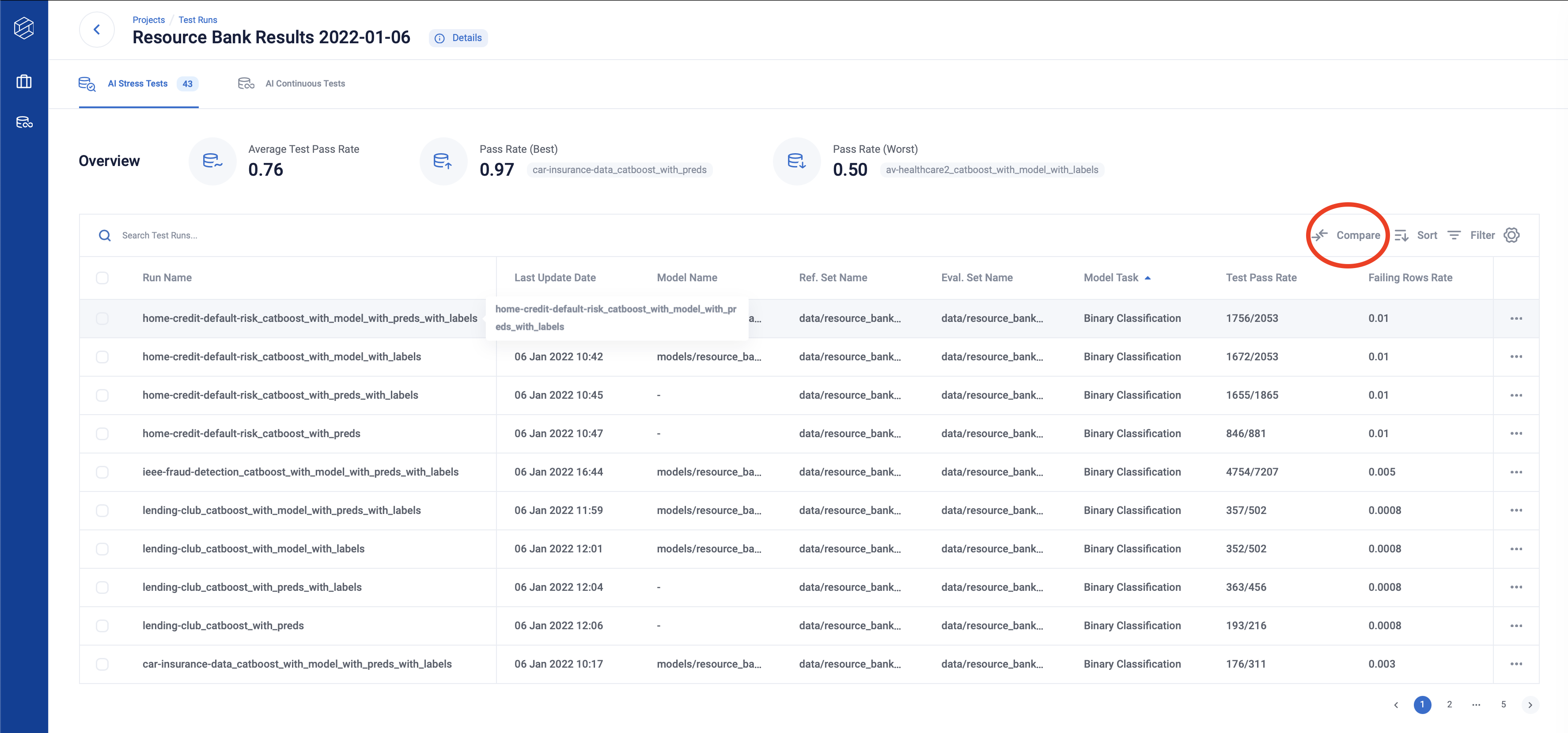
You can compare eligible test runs from the project by selecting them from the dropdown.
AI Stress Testing
All test results and their summary metrics are here.
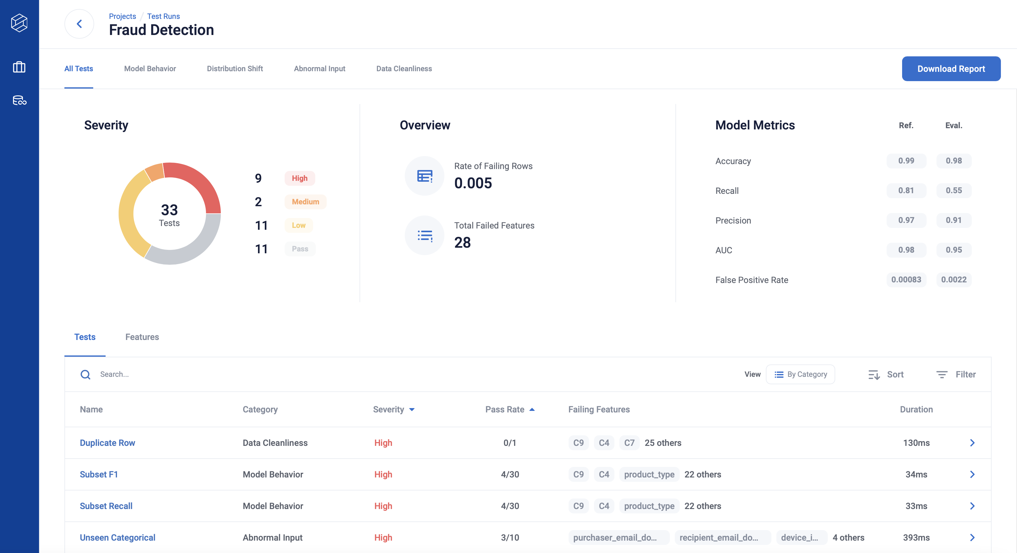
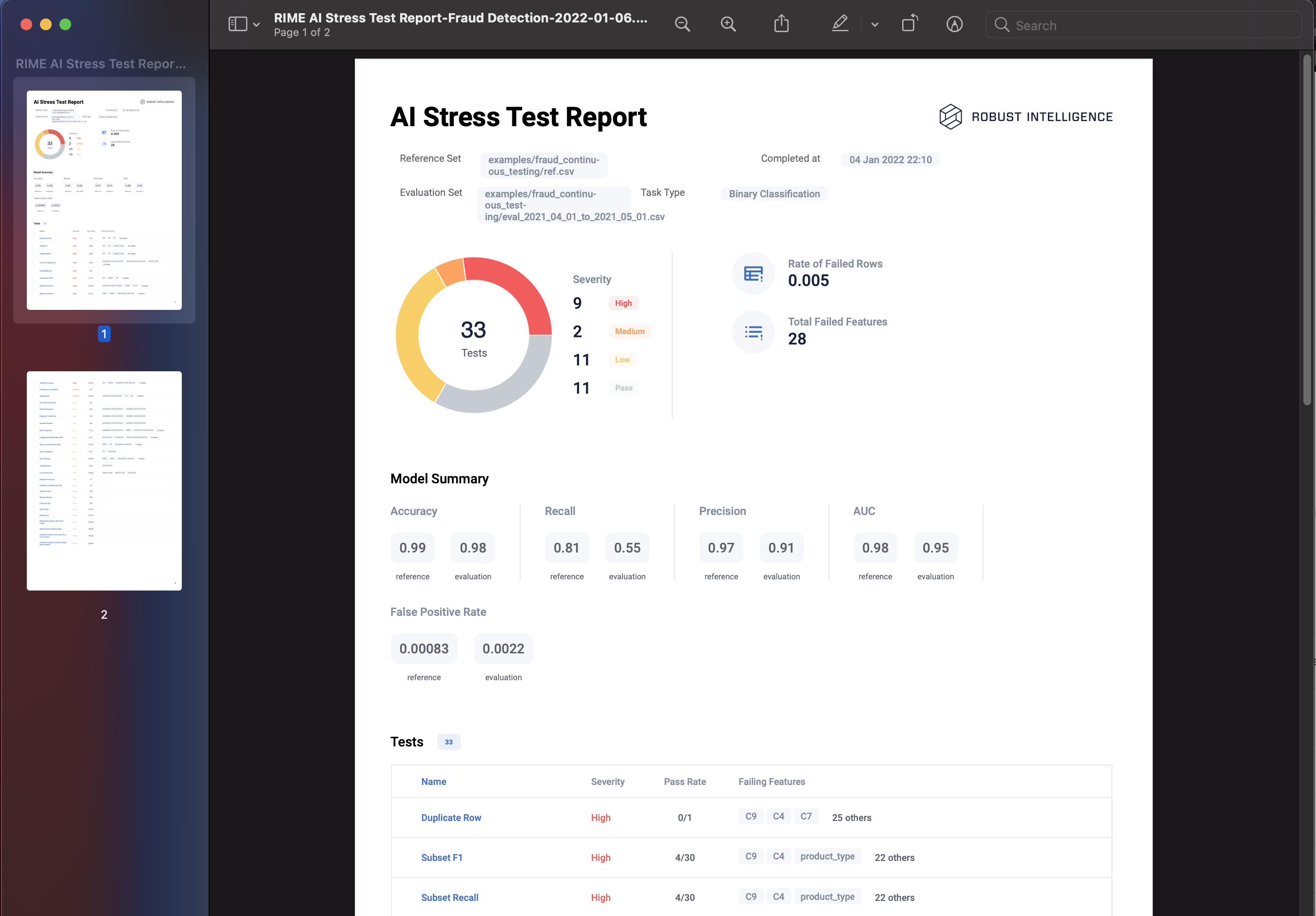
You can click the Download Report button to export a summary pdf.
You can search, sort and filter the tables to evaluate test results with the view of your preference.
You can hover over the table header to reveal a description on the column.
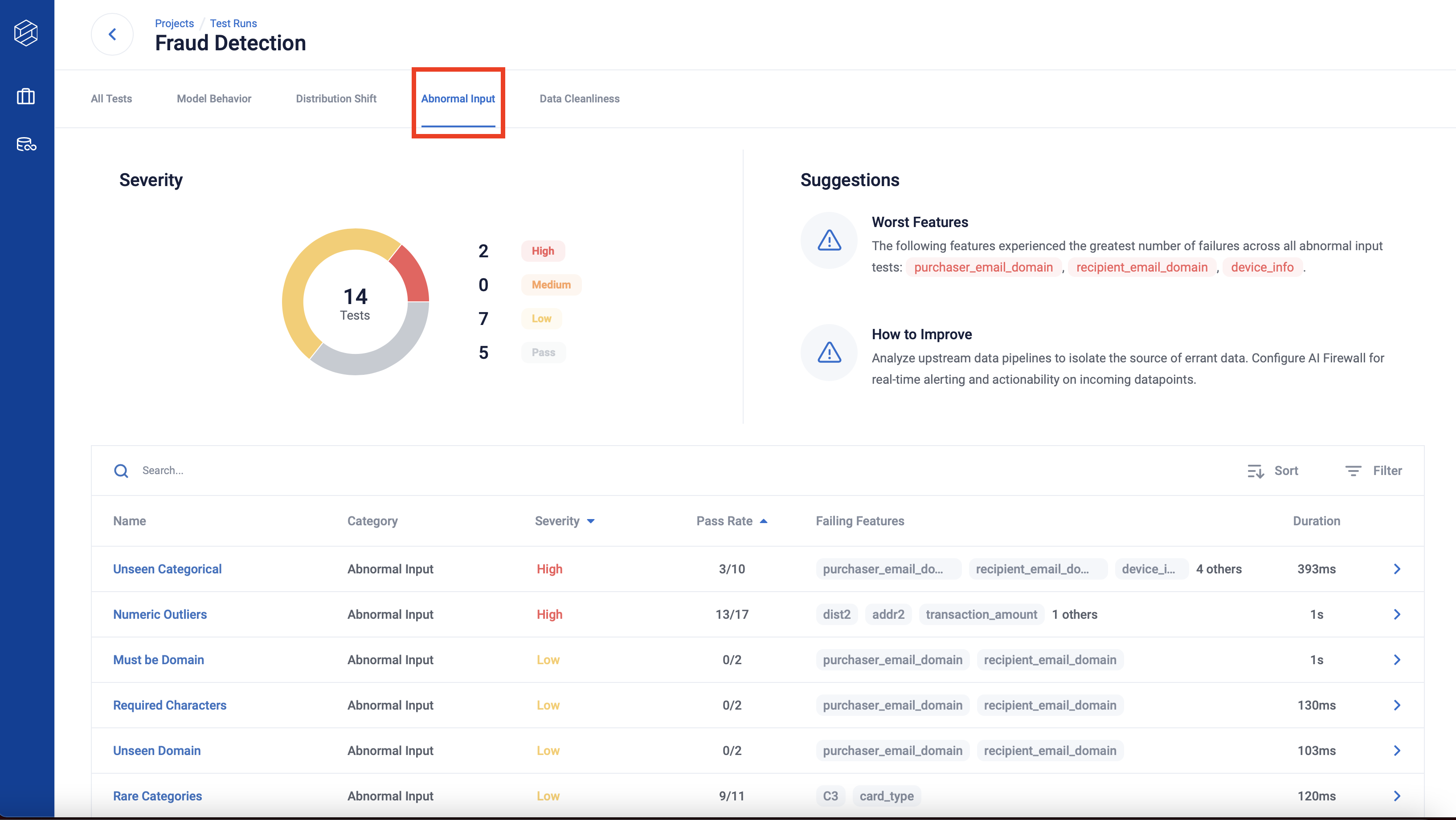
You can view the tests by category, and the category tabs include suggestions created from the test results.
Test Detail - Test Cases
Upon clicking a row you will get routed to a test detail page.
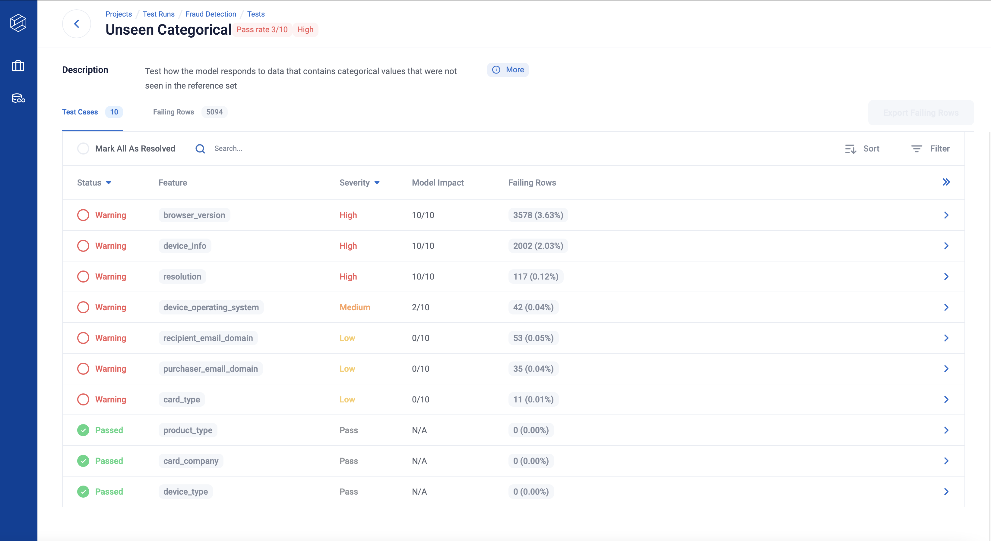
If you click the (i) More button, you can read an in-depth context of the test.
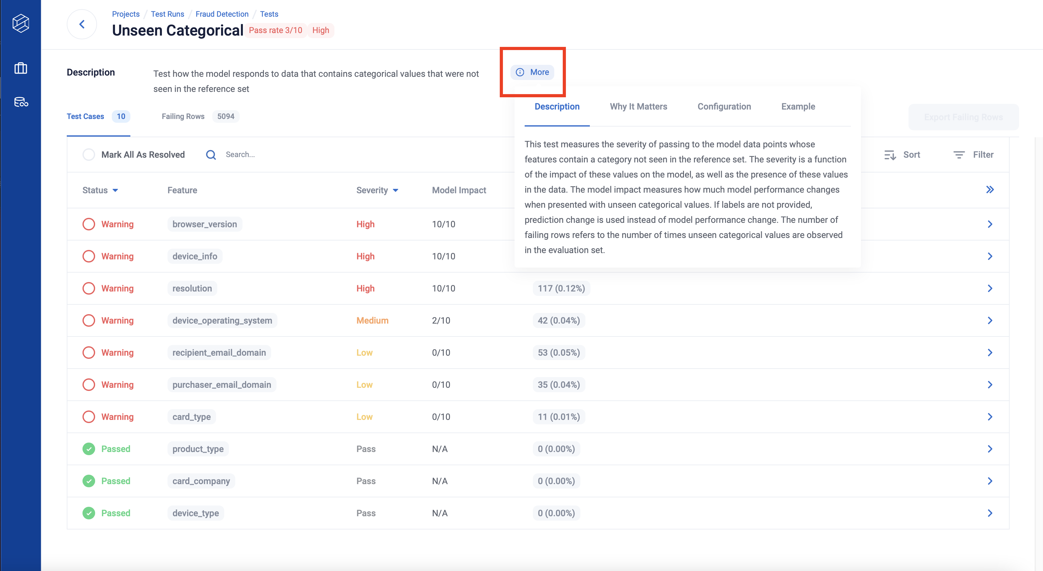
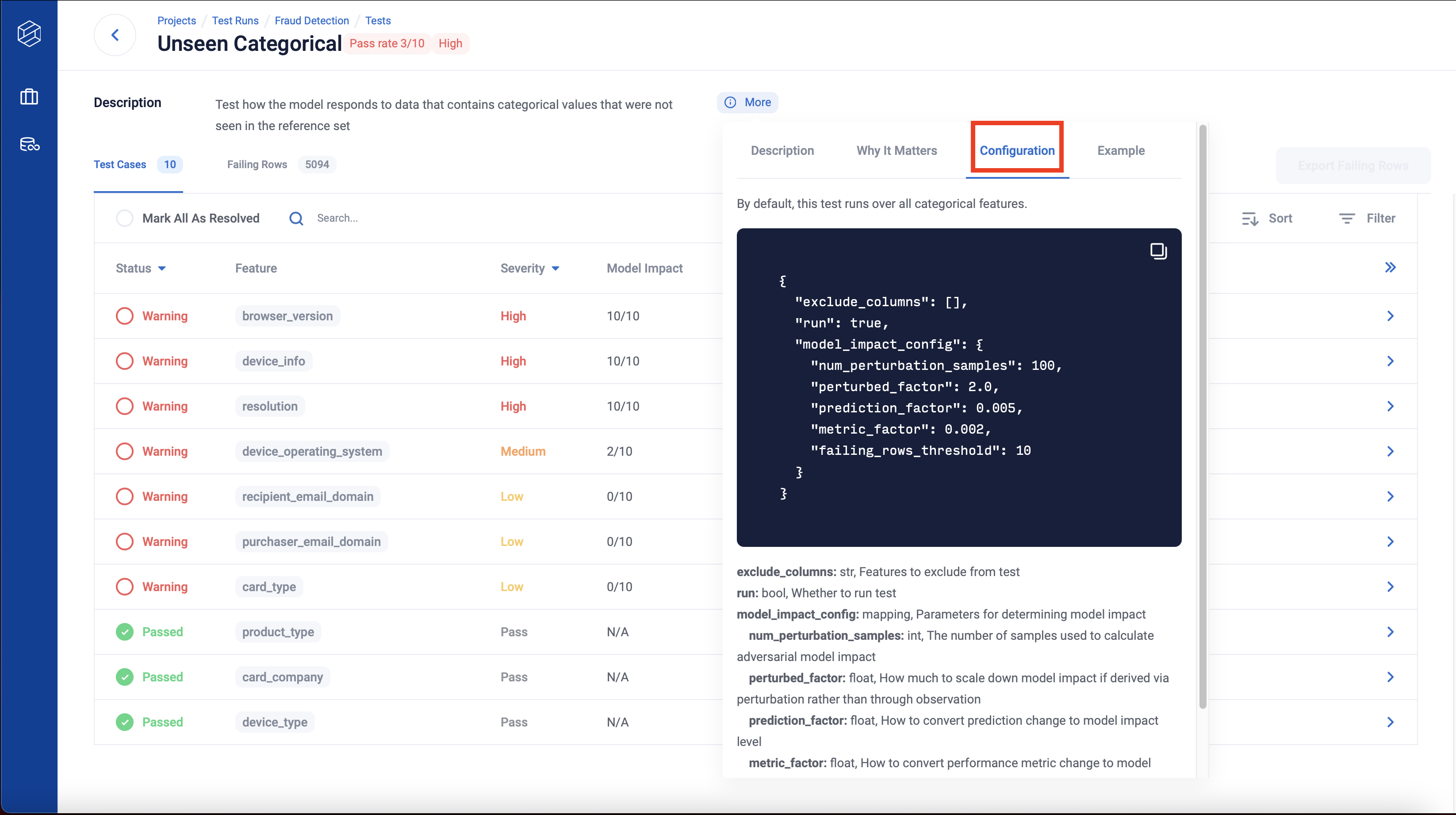
Clicking on the “Configuration” tab reveals the configurations used for the test, as well as their descriptions.
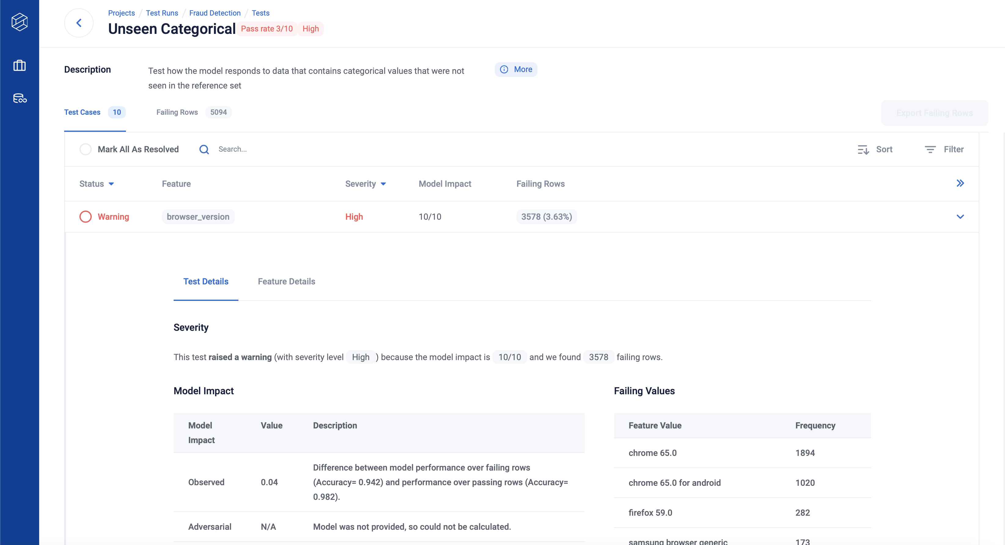
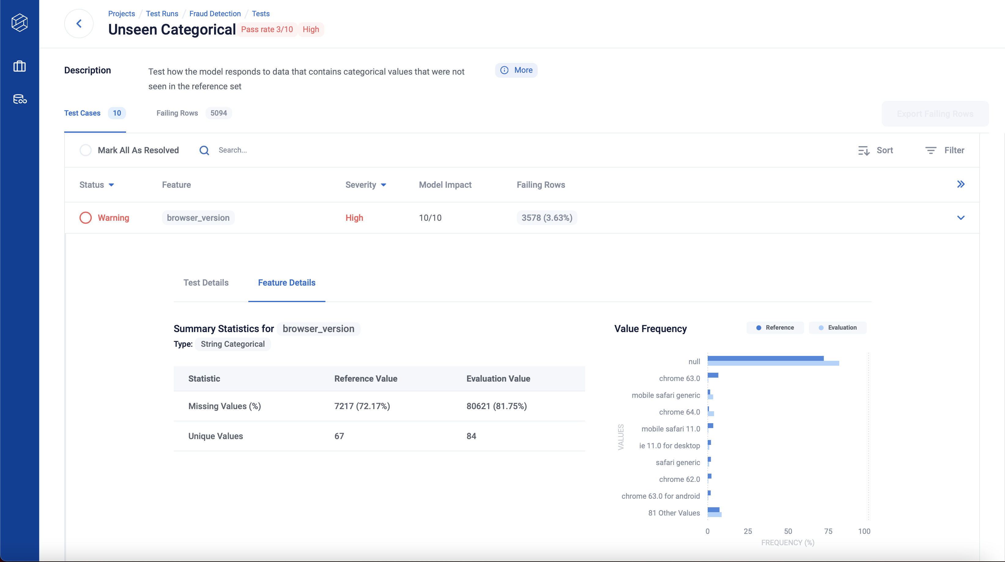
When you click to expand a test case row, you will see details of the test case result, as well as details of the feature distribution.
Tip: You can use Esc key for returning back to the list of tests/features page.
Test Detail - Failing Rows
The second tab of the Test Detail page is Failing Rows. If there were rows in your data that failed the test, this tab will surface twenty examples for you to explore.
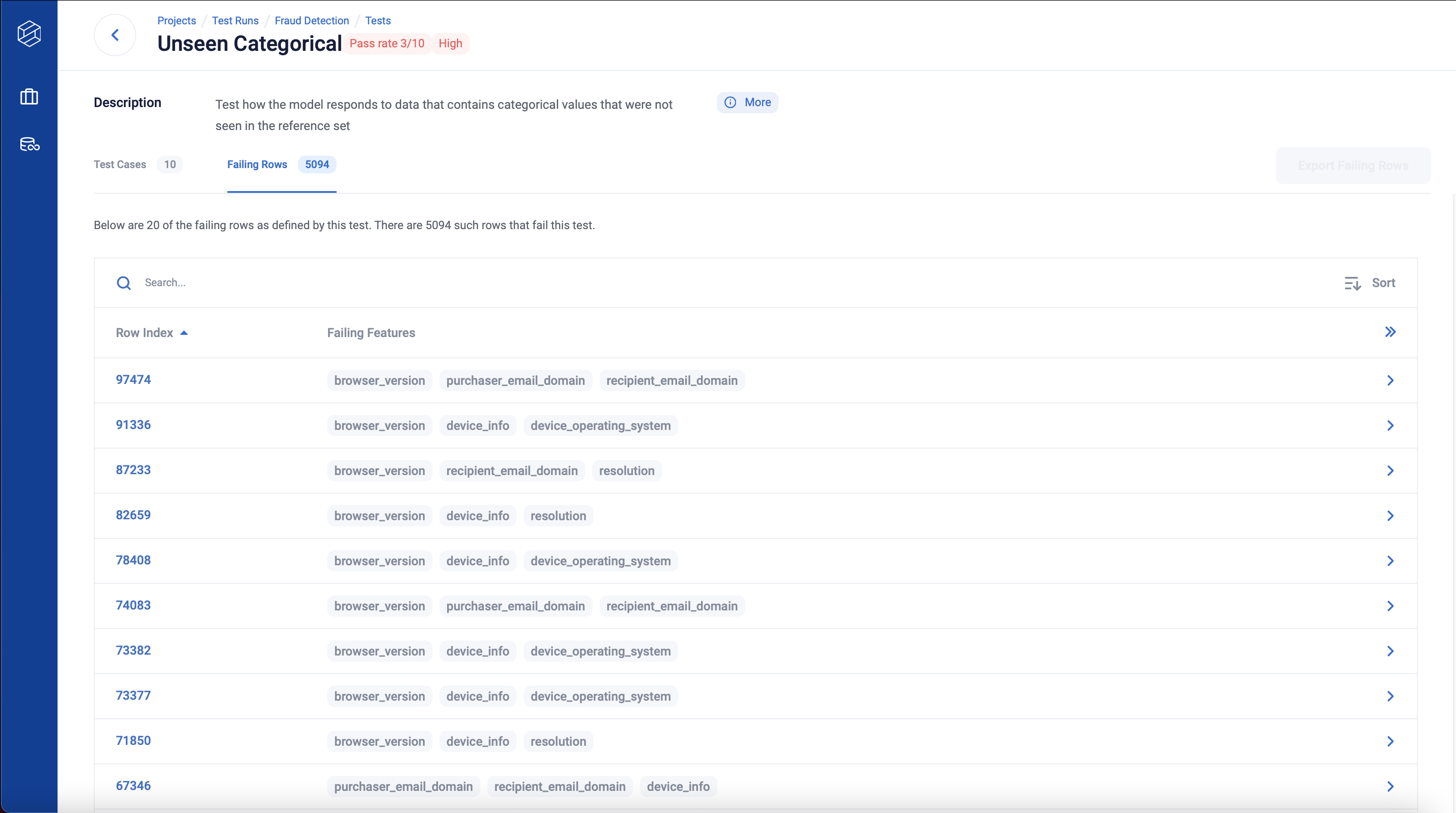
If available, you can download failing rows as a csv through the Export Failing Rows button.
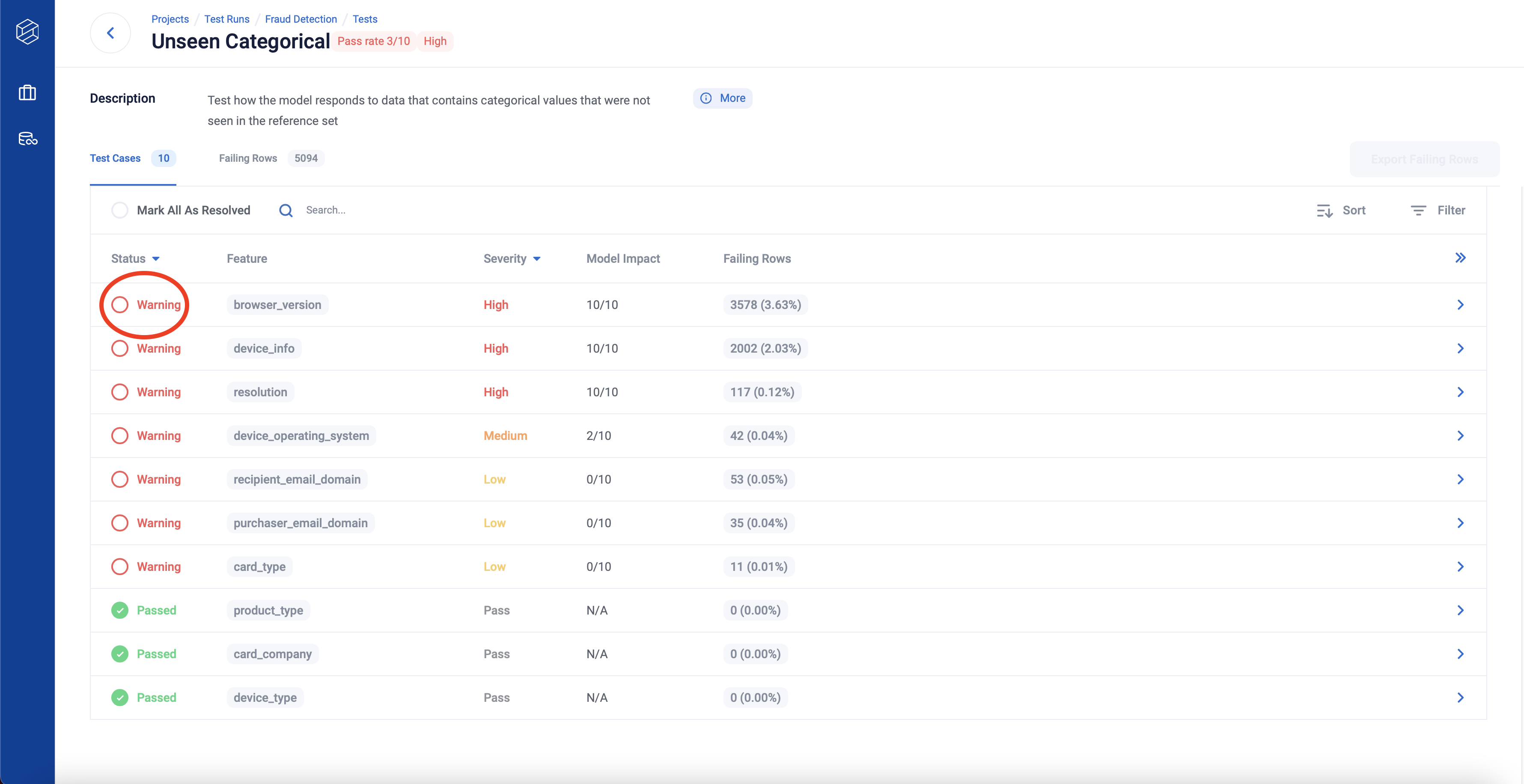
Test Detail - Resolve
You can resolve any test case with a warning status by clicking the status, with an option to resolve all test cases with warnings under the test.
For example, before resolving any test case you may see something like this.
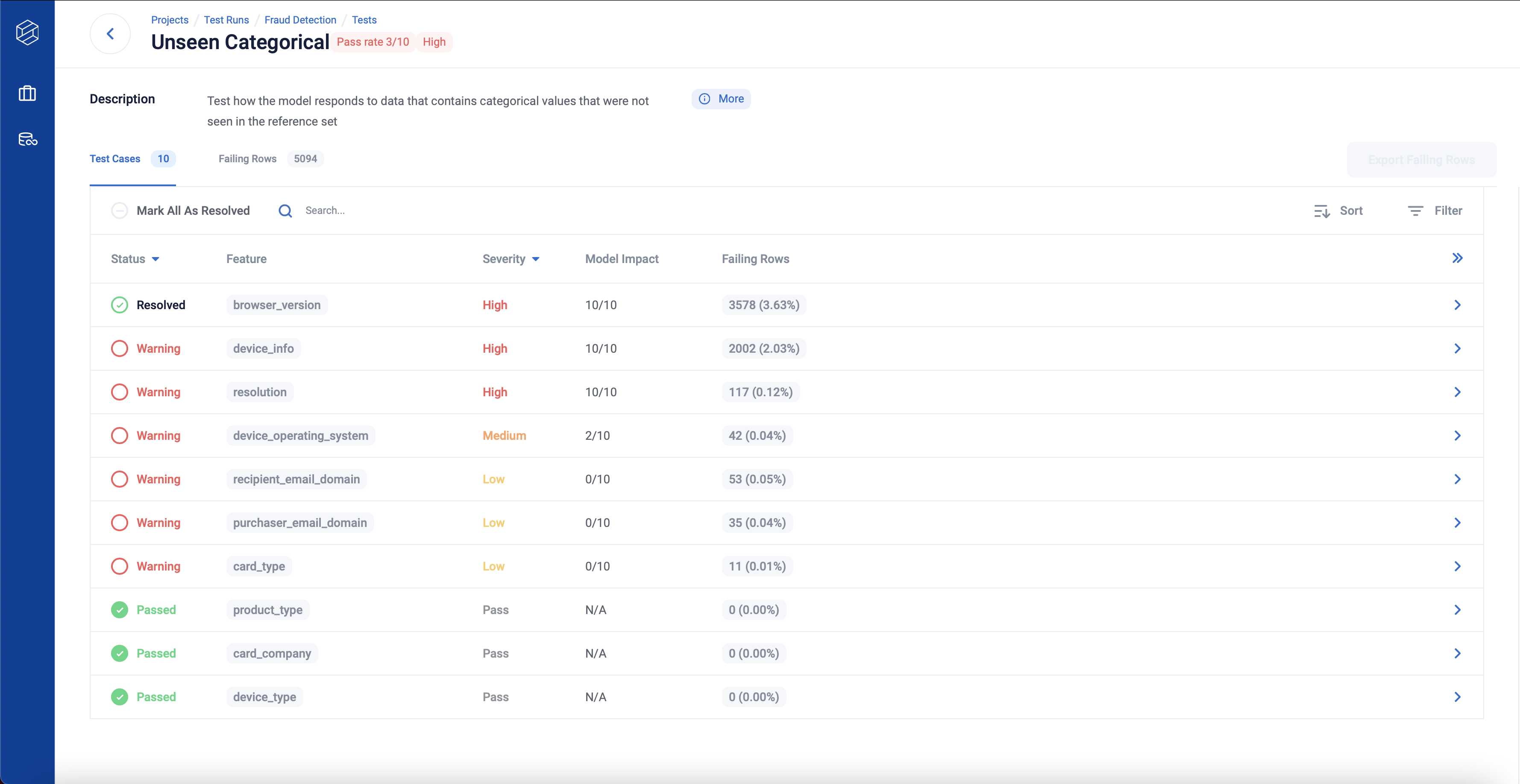
After clicking warning to resolve a test case, the test case is marked as resolved.
AI Firewall
The AI Firewall provides functionality for continuous tests model metrics over time as well as blocking, flagging and imputing data points in realtime as your model is queried.
AI Firewall Overview Page
The default tab for the AI Firewall is the following Overview page.
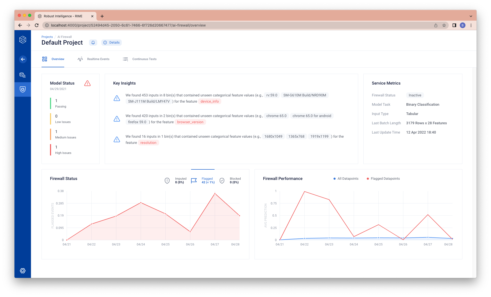
There are five different panels in this page.
Model Status: This panel highlights the severity of various metrics that are tracked over time as part of AI Firewall Continuous Tests. For more information on these metrics and how the severities are calculated, see that section below.
Key Insights: This panel highlights Key Insights from AI Firewall Continuous Tests. For information on these Key Insights, see that section below.
Service Metrics: This panel features key information about the AI Firewall, how it was configured, and recent event information.
Firewall Status: This panel shows the number of imputed, flagged, and blocked datapoints passing through the AI Firewall over time.
Firewall Performance: This panel shows the performance, over time, of the model on all datapoints versus just those that were flagged by the AI Firewall.
AI Firewall Realtime Events
The AI Firewall Realtime Events tab enables viewing inputs blocked, flagged or imputed by the firewall. The custom firewall is based on the model impacts and data vulnerabilities identified during testing. For more information on the firewall, please visit AI Firewall How-To.
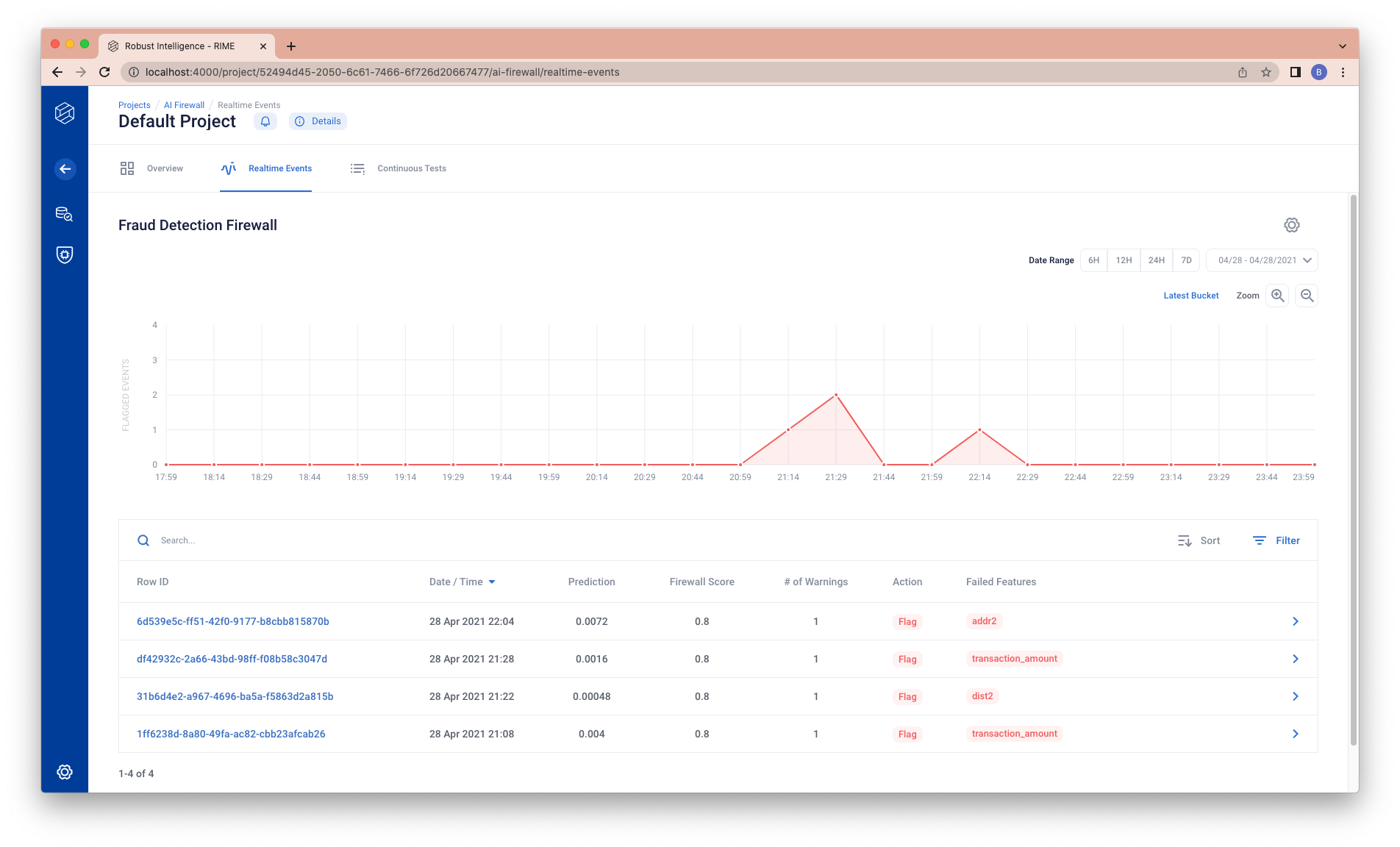
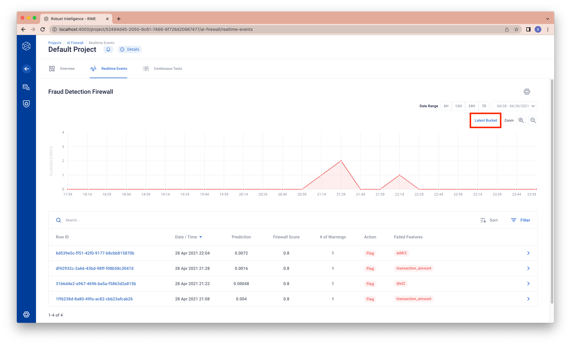
By default events are shown for the latest period of time. To view the most recent period of time with events, clock on “Latest Bucket”.
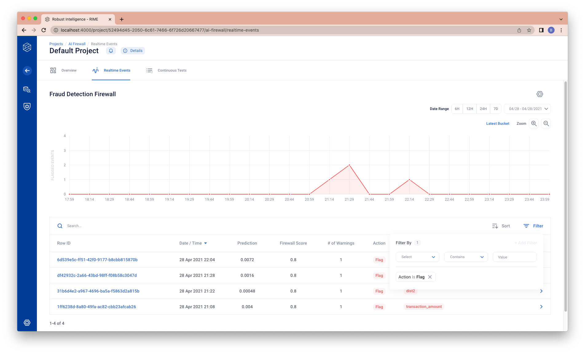
You can filter the rows being shown (e.g., filter to only show flagged rows).
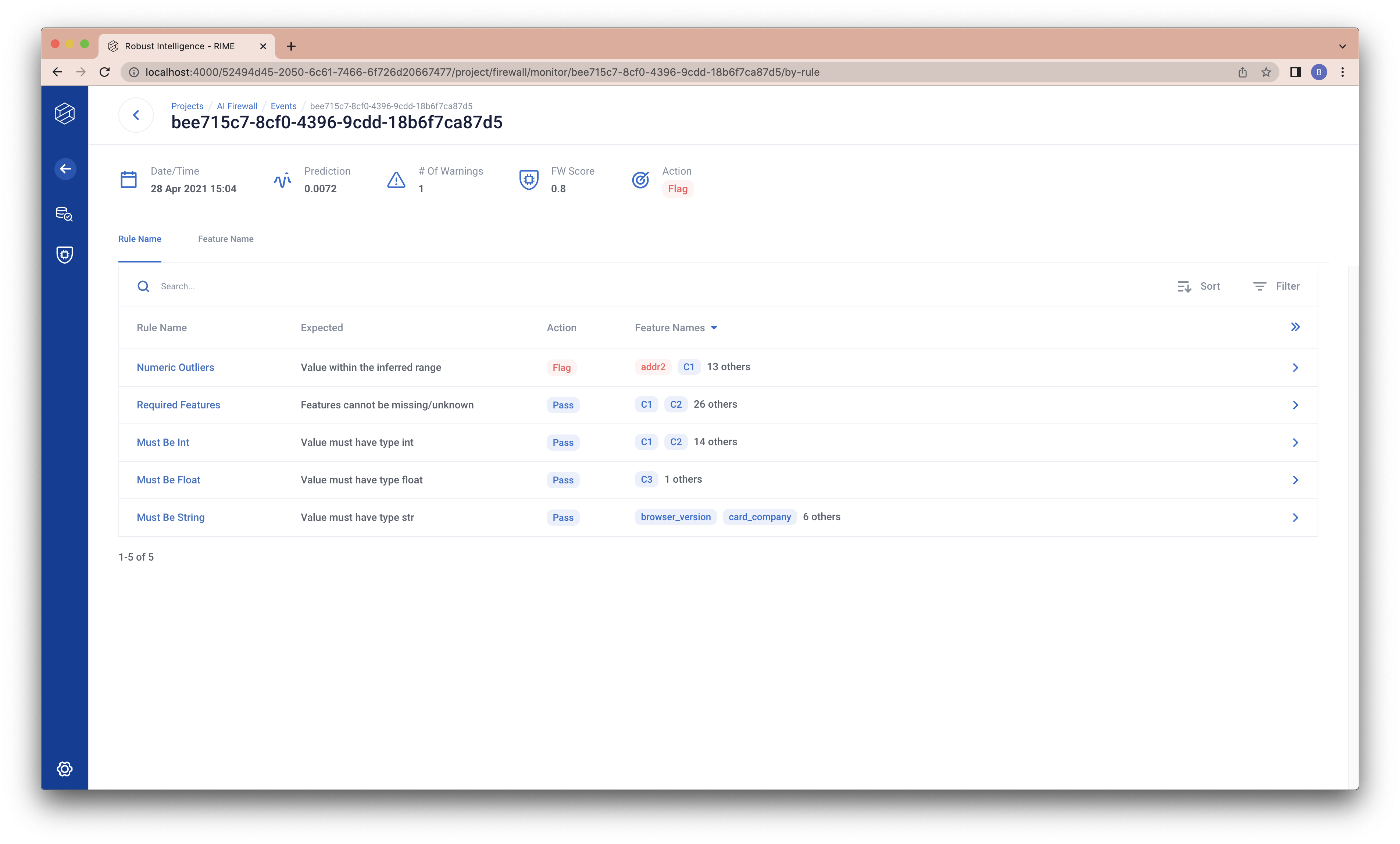
You can see the details of firewall behavior on a row by clicking on it in the table.

You will be directed to a page with more details.
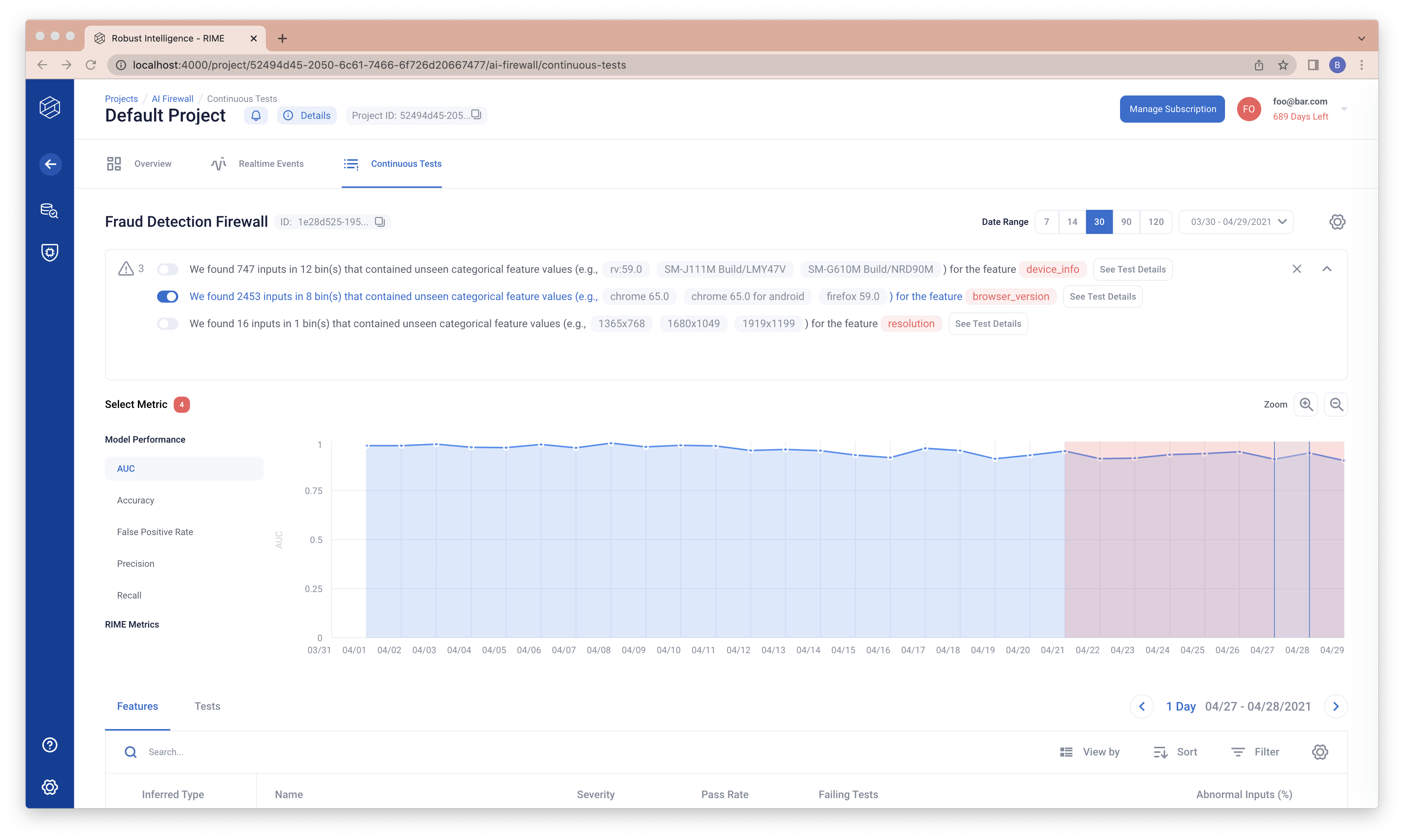
AI Firewall Continuous Tests
The AI Firewall Continuous Tests tab enables tracking relevant metrics over time and diving into test results for different time intervals to diagnose the underlying causes of issues. For more information on running AI Firewall Continuous Tests, please visit AI Firewall Continuous Tests Walkthrough.
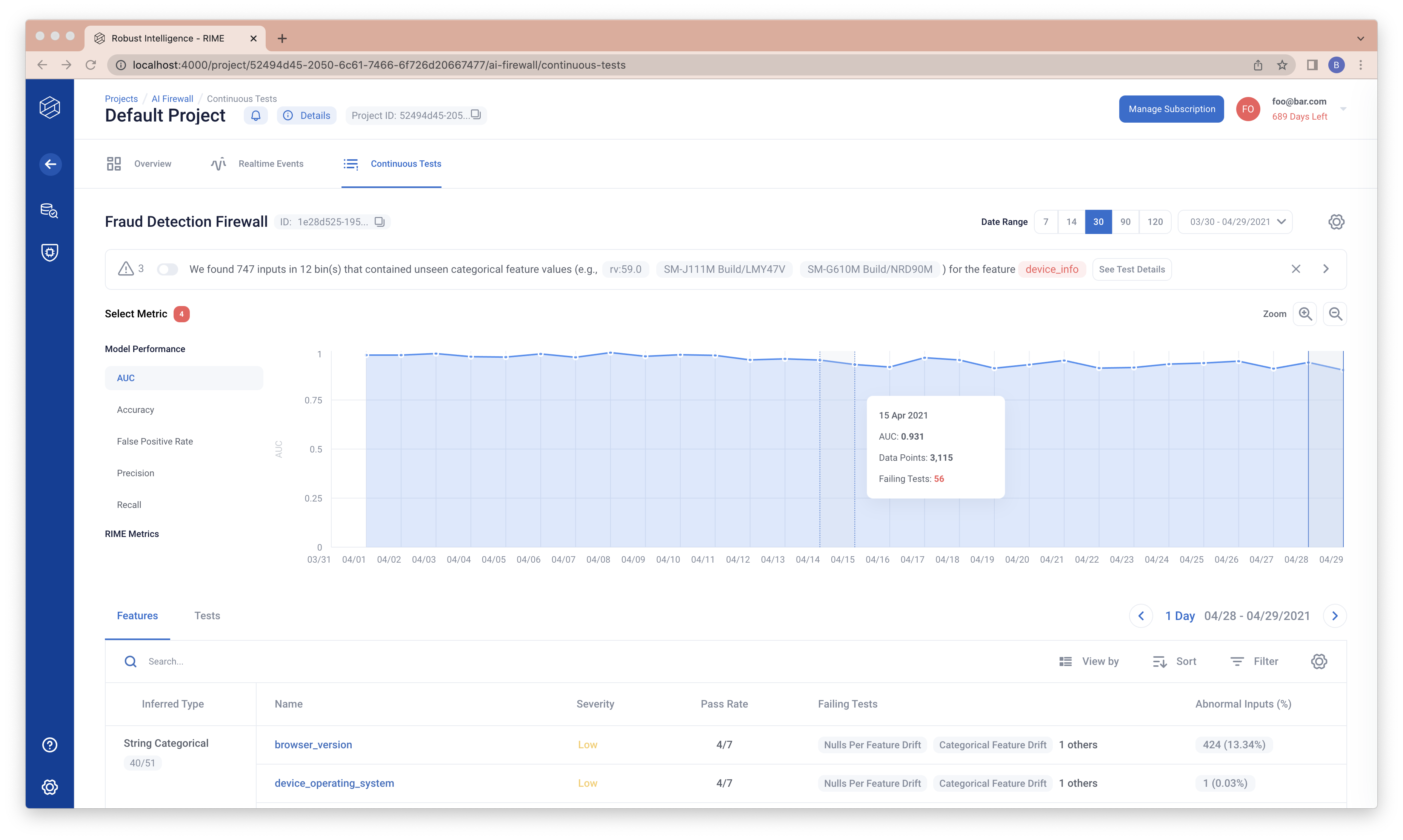
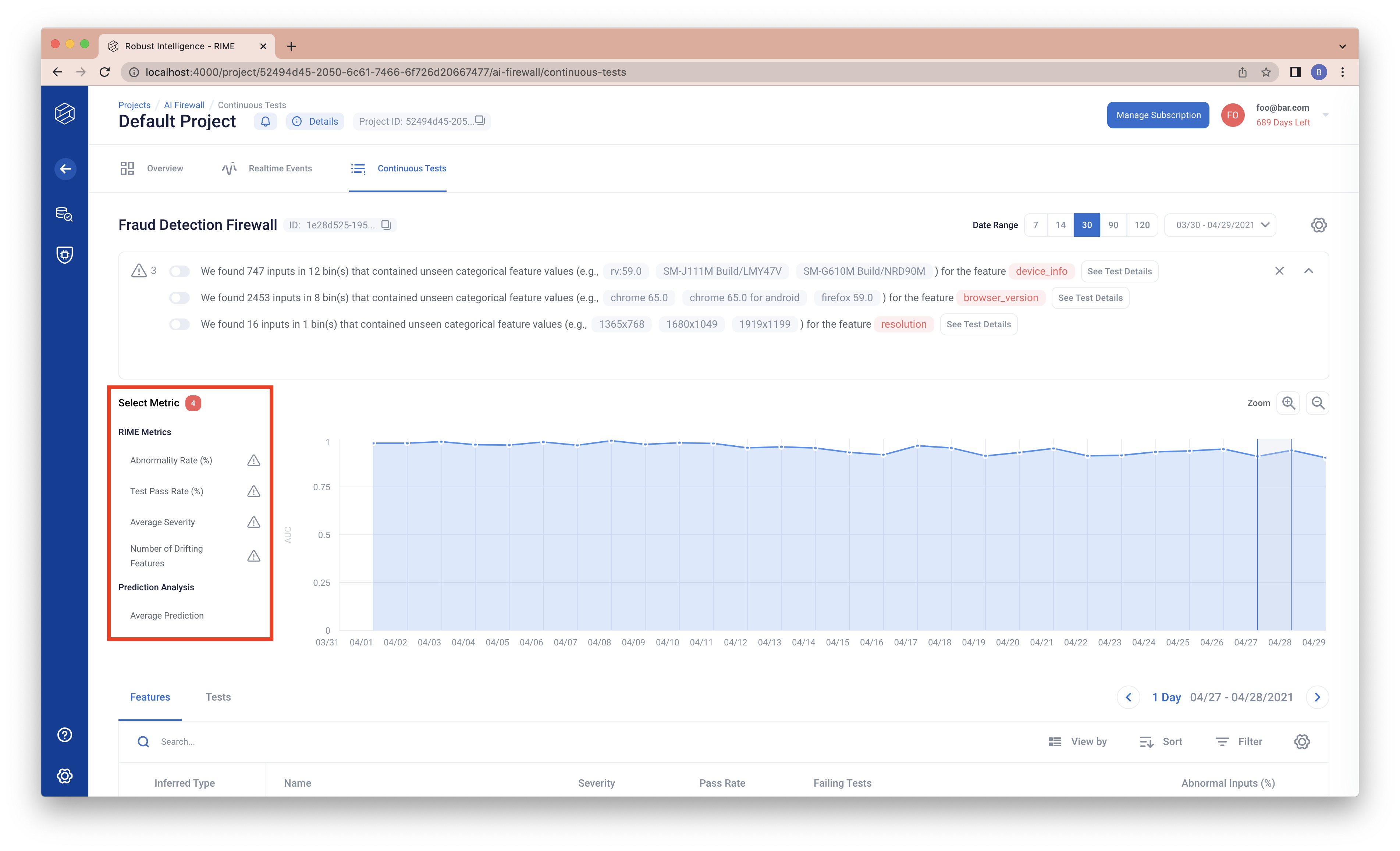
The chart shows summary metrics over the range of time the firewall has been in use. These summary metrics summarize tests that we run over each bin of data (e.g., each day). You can change the summary metrics shown (y-axis on the chart) through the top left dropdown. For a subset of these metrics (RIME Metrics) we provide thresholds indicating an estimated severity of the observed metric. For each metric, there is a Low, Medium and High severity threshold. These thresholds are computed based on the stress test run associated with a firewall: for example, if we observed an abnormality rate of 1% during stress testing, we’d be concerned if the abnormality rate rises significantly above 1%.
The table below shows the tests of the selected bin (one day or one hour). By clicking on the chart, you can select the range to be the current range.
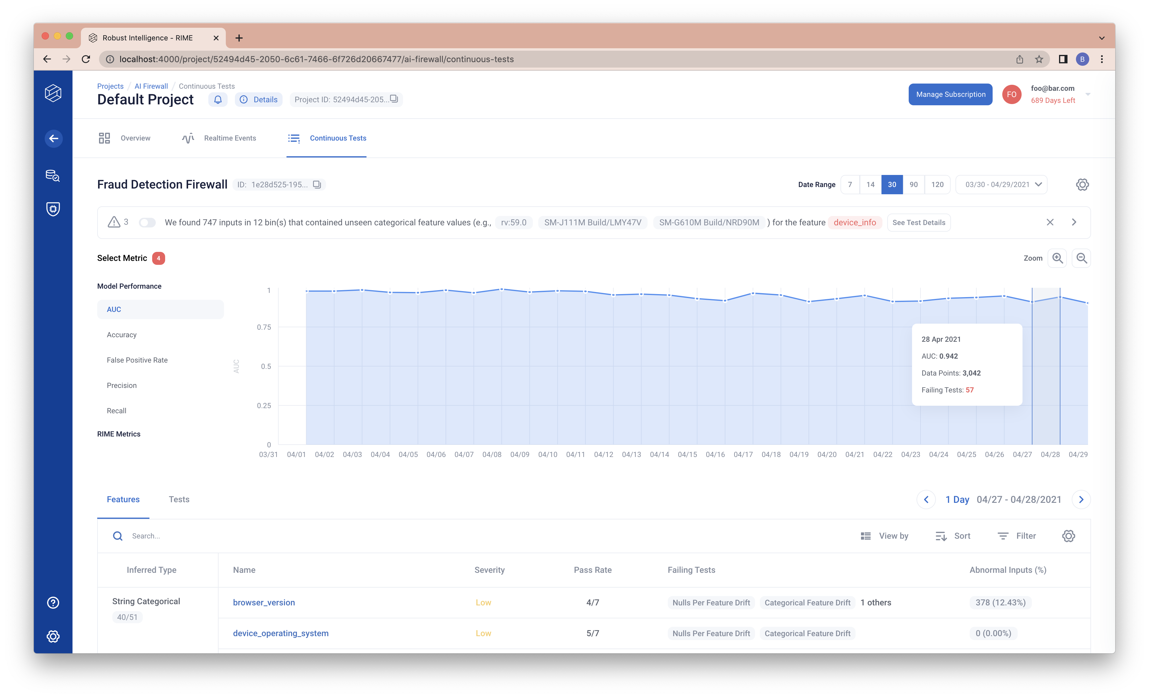
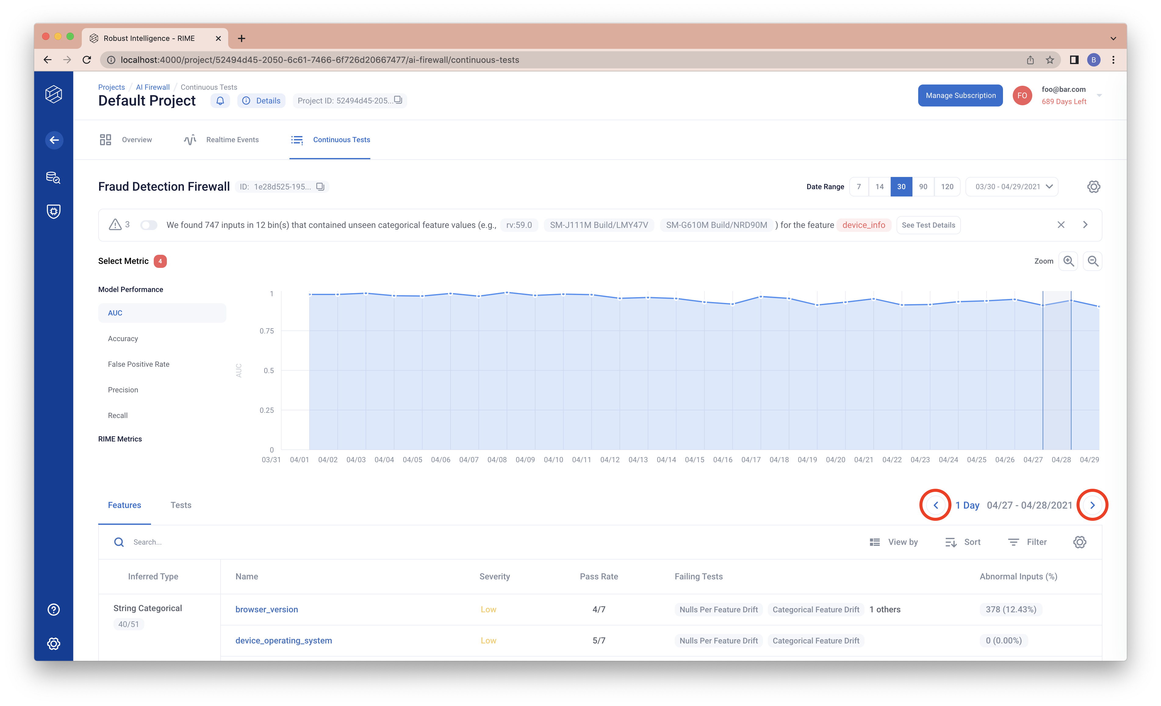
You can also use the left and right button to select the previous and the next bin.
You can change the date range (x-axis on the chart) through the top right buttons.
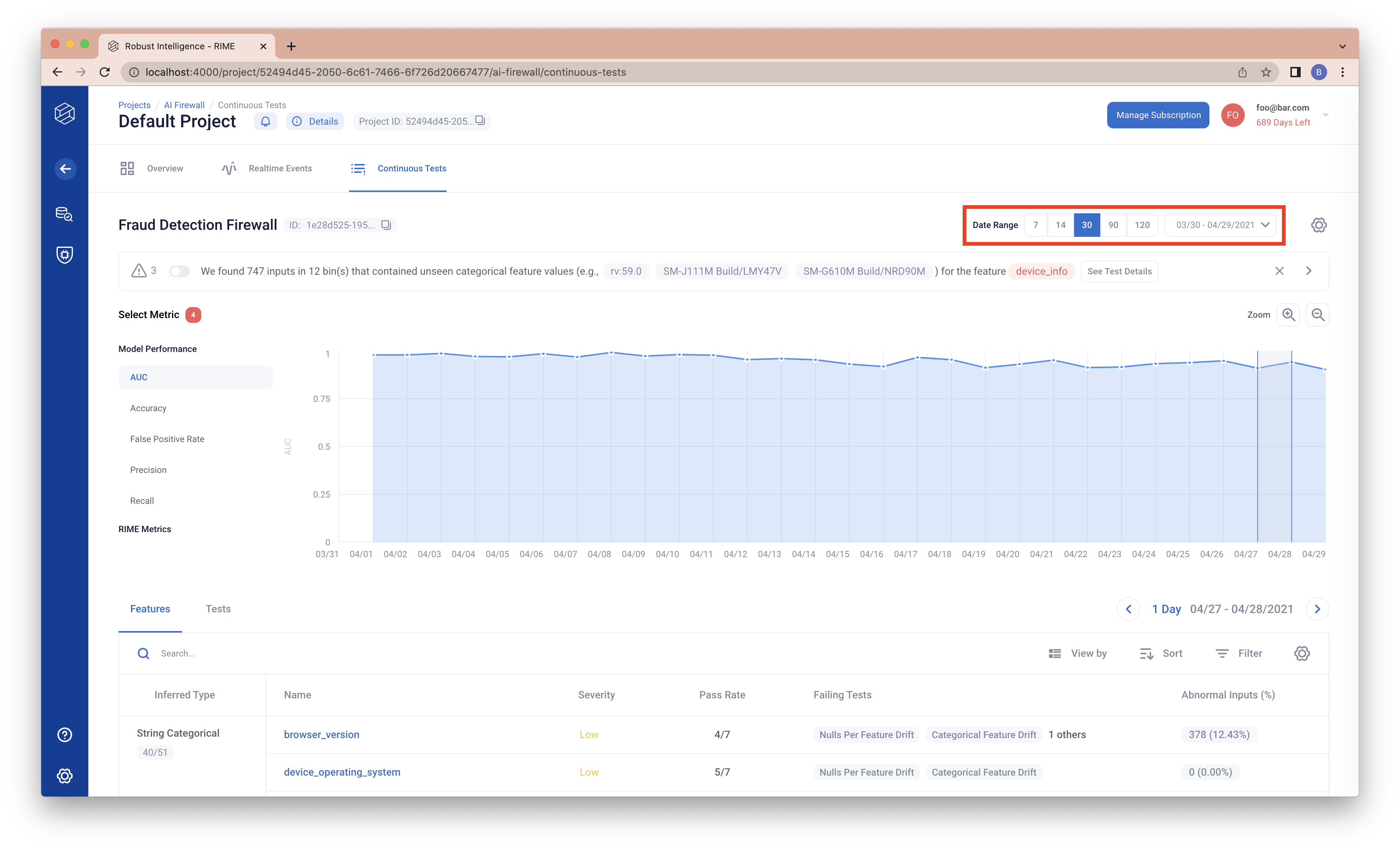
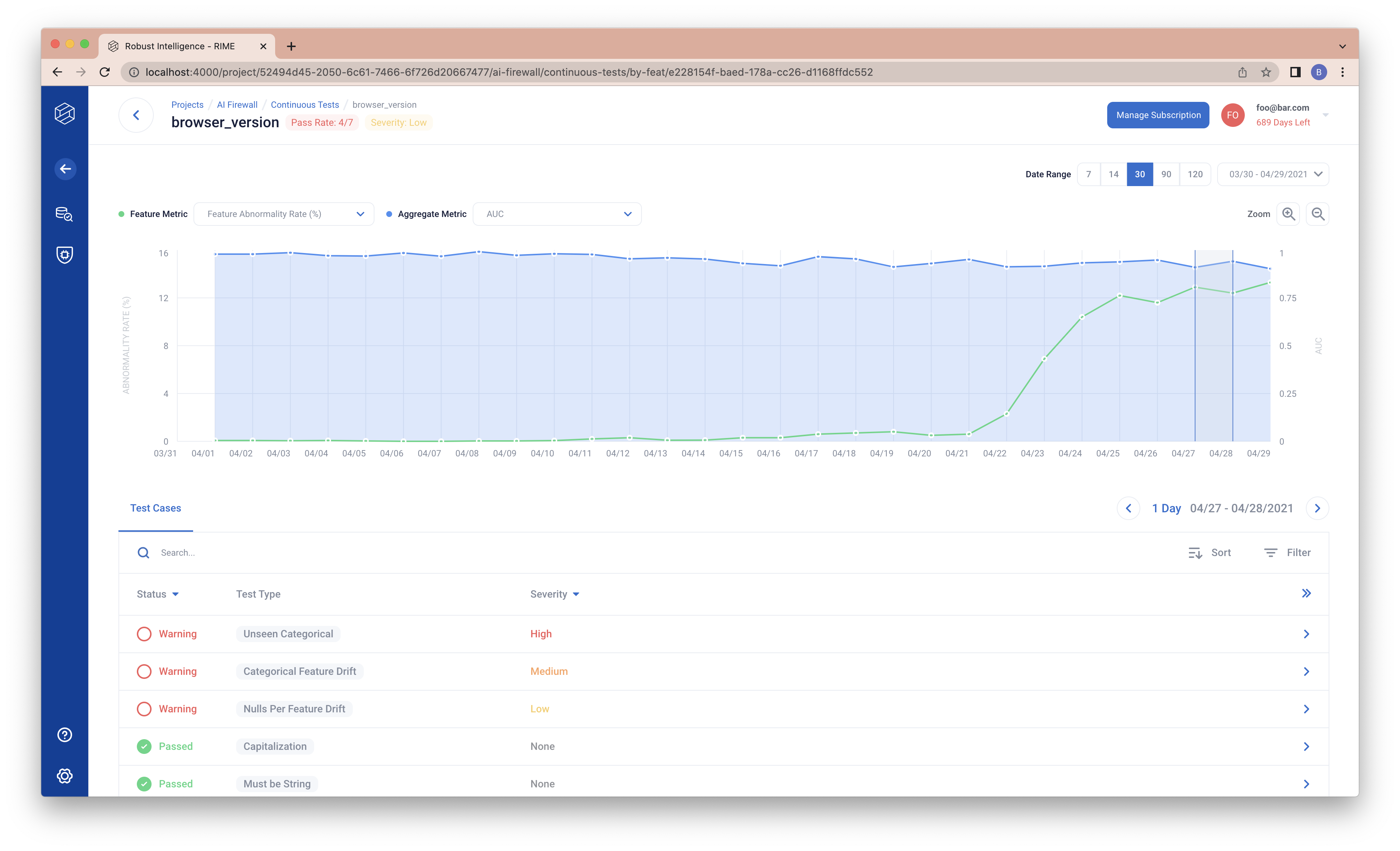
You can see the details of the feature or test by clicking the test table row.
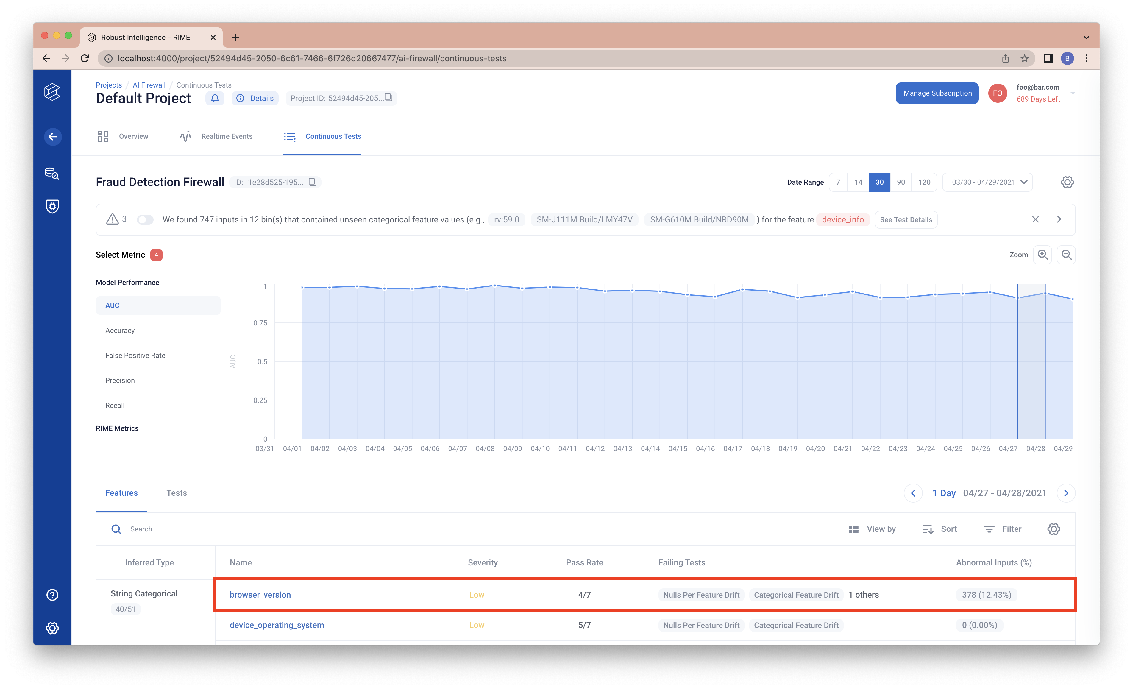
You will be directed to a feature or test level page. There is additional charting available in the feature level page.
To see the key insights identified by RIME, click on the icon near the top corner of the chart (note that you may be able to scroll to see more insights).
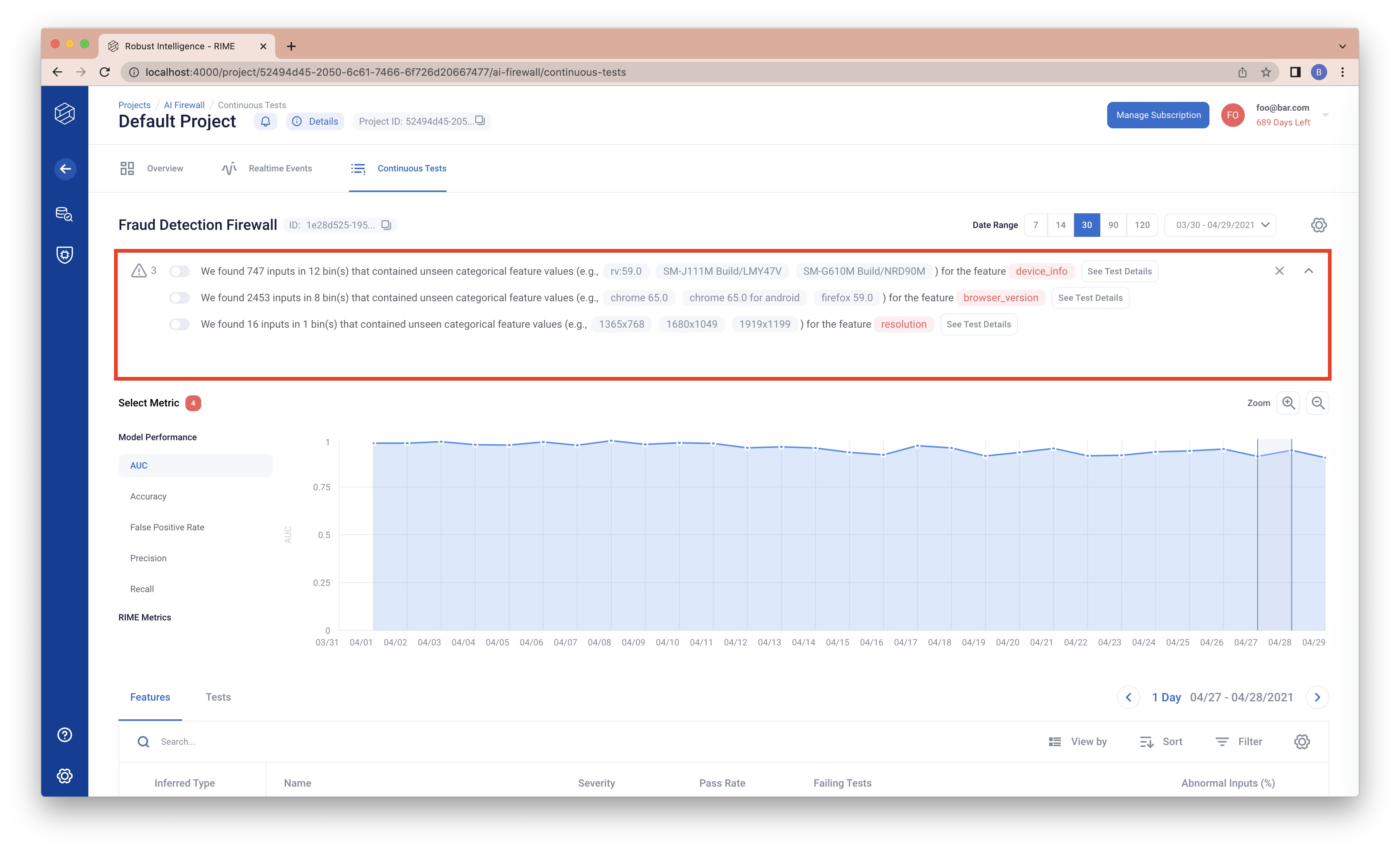
You will see the descriptions of the recurring high severity test cases. You can toggle each to highlight the bins in which they occur. You can also view the details of the latest test case by clicking on “See Test Details” on the right.